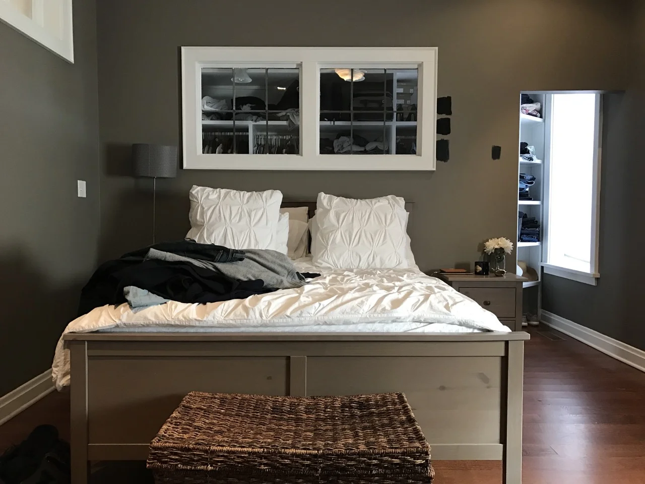
For a young couple who share a love of travel and seeing the world, the idea of coming home to a more minimal space made perfect sense.
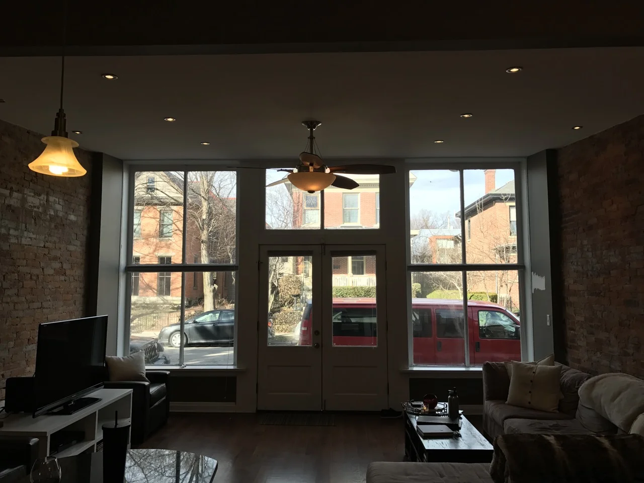
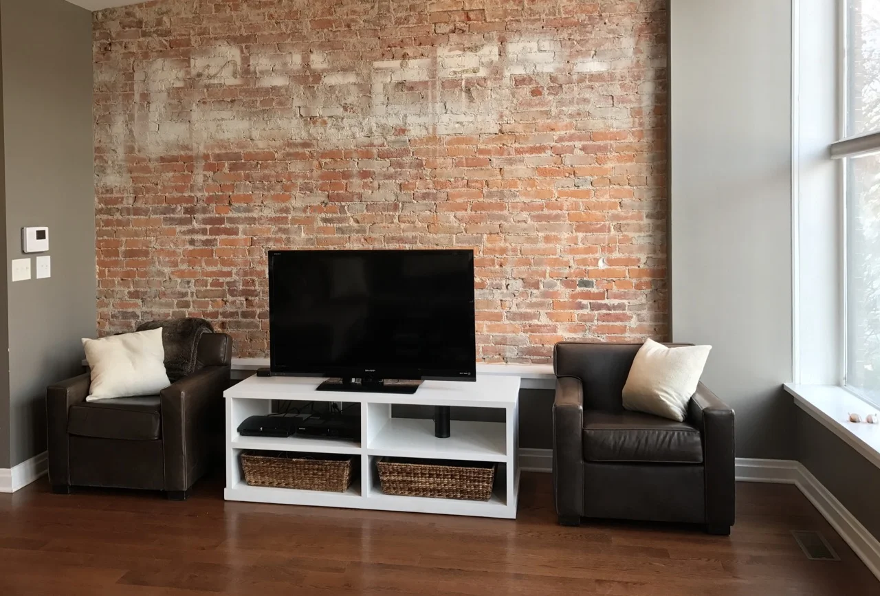
With this condo being a renovated storefront, we had plenty of unique features in the space worth highlighting: Large front windows. High ceilings. Exposed brick walls. A large, loft-like main room. I couldn’t wait to amplify these architectural elements with furniture, décor, and art.
In order to create the right layout for the space, we drew on the owners’ appreciation of boutique hotels around the world. I was inspired, in particular, by some of my favorite and most inviting hotel lobby designs: Those spaces you’d much rather work from instead of the office, meet friends for a snack or a drink, or just enjoy a few spare minutes soaking up the vibe. We built off this concept for a multifunctional space for entertaining, eating, reading, working, cooking, and relaxing with rearrangeable seating to give the opportunity for one giant conversation or several small ones. Low furniture to open up the room and keep clear sight lines. Sofas, chairs, poufs, and pillows you can sink into. A banquette that feels more like the best table at a coffeeshop than a home dining table.
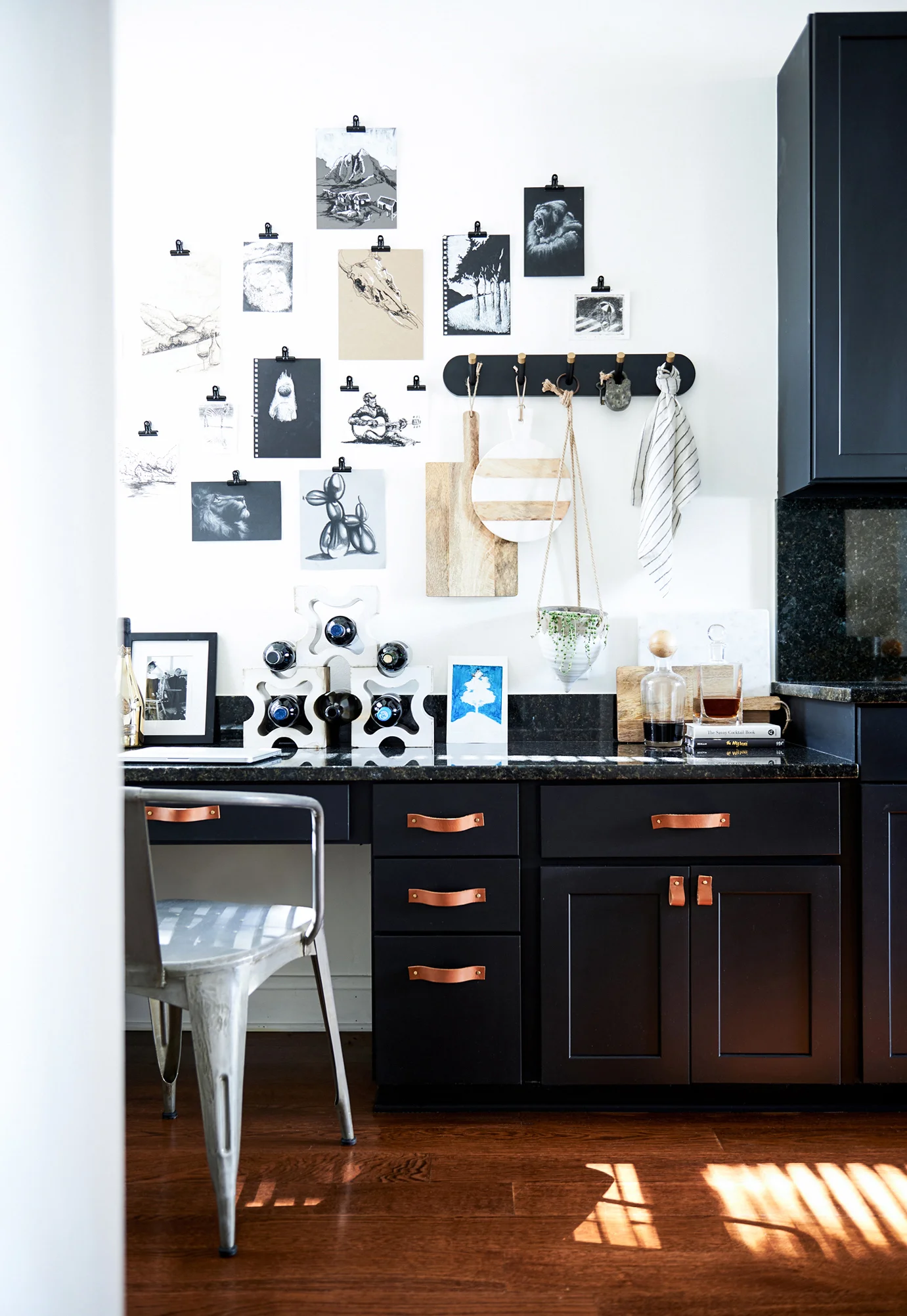
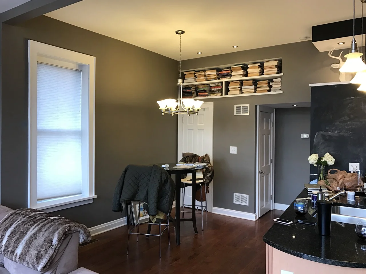
Once the concept and layout for the space was decided, the next challenge was to strike the right balance of cool minimalism with the warm, inviting appeal of lived-in and layered spaces. Sticking to a clean neutral palette helped to create a calming feeling in the space, and texture was key to building dimension using linen, concrete, and canvas to name a few. We focused mostly on whites and creams, but added contrast with tobacco leather and matte black paint (the kitchen cabinets and the ceiling).
From there, it was all about pulling the place together with personalized, collected touches. Art was key, with most pieces created by the owner’s brother and a few from friends as well. A pouf hand-picked from a market in Marrakech on a recent trip there. A string chair inspired by travels to Oaxaca a few months before that. Wine storage made from salvaged midcentury bricks. A few well-placed pops of teal, the owner’s favorite color.
In the end, the question I’ve been contemplating is this. Once you bring hotel vibes home, does that make you want to travel less?
Doubtful.
Scroll for the full before & after.
BEFORE
AFTER
BEFORE
AFTER
BEFORE
AFTER
BEFORE
AFTER
BEFORE
AFTER
BEFORE
AFTER
-JS
AFTER photos by Alexandra Ribar
Want to see more? Check out my other interior decorating work on my (small but growing!) portfolio page here.


