When Holly and Brian and their daughter Avery moved to the suburbs, they wanted to make sure that their downtown sensibility translated to their new home. They also wanted to embrace larger spaces in a way that would give them ample opportunities for playtime, downtime, and making memories as a family. The solution? We filled their new house with a layered mix of cool neutrals balanced with warm, family-friendly touches.
Holly and Brian have great taste, and a lot of the furnishings for their home were already owned. My challenge was to figure out where the existing pieces would go in the new space, and what additional décor and furniture would be needed as they grew into a home that was considerably larger than the last. It can be both an exciting and daunting process to make existing furniture and décor work in a new space. But in the end, you get the chance to feature your favorite pieces in new layouts and vignettes, giving them new life and context. And I think that’s a pretty fun process.
Want to see where we took Holly, Brian, and Avery’s home? Scroll for the tour.
THE ENTRYWAY
An entryway is a home’s first impression that sets the tone for the rest of the spaces throughout. I knew we needed a moment that felt warm and inviting but also cool and current.
My friends and I actually gave Holly and Brian the Jay-Z throw pillow that ended up in the entryway (it was a gift for their baby shower several years ago right before Avery was born). The pillow resided in Avery’s nursery in their previous home, but this time around, it was definitely time to put Jay front-and-center.
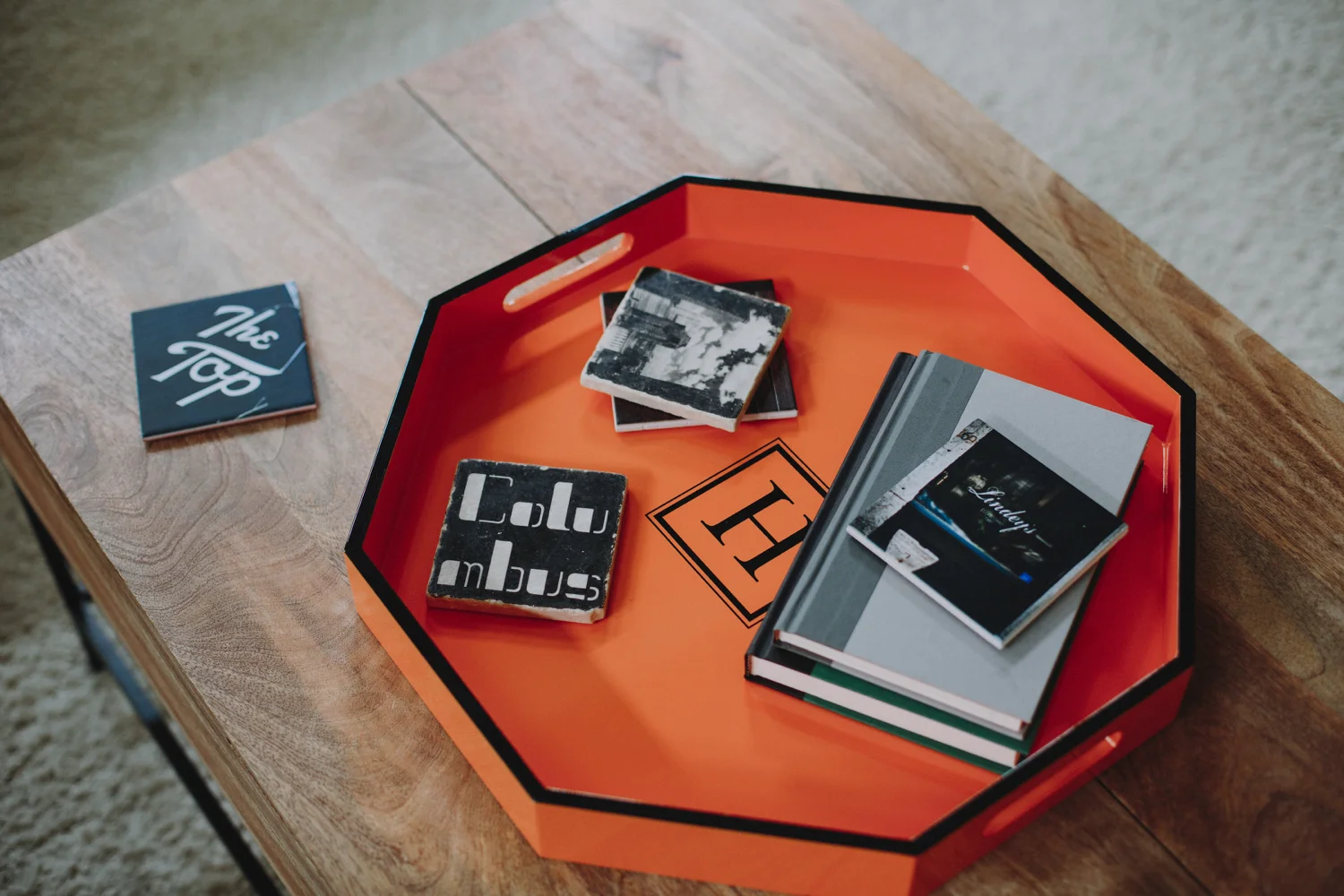
From there, we also featured photography from Holly and Brian’s wedding, some framed playful prints, and a few succulents to give the space an eclectic personality within a mostly neutral palette. OK, fine--I couldn't resist a pop of orange. But I personally think it looks pretty chic.
THE LIVING ROOM
We took a rather minimal approach to the living room, focusing on more rustic touches that would turn an other formal use of space into an approachable seating area. In keeping with the rest of the house, the room is adorned in a palette of greys and browns, with a few citron accents as light, optimistic splashes of color.
THE DINING ROOM
I enjoyed taking the dining room in a slightly moodier direction. By painting a dark grey shade above the chair rail, we added drama and contrast that was only amplified by the starkness of the cement furnishings and the gothic appeal of black-and-white Fornasetti plates used as wall art.
THE STUDY
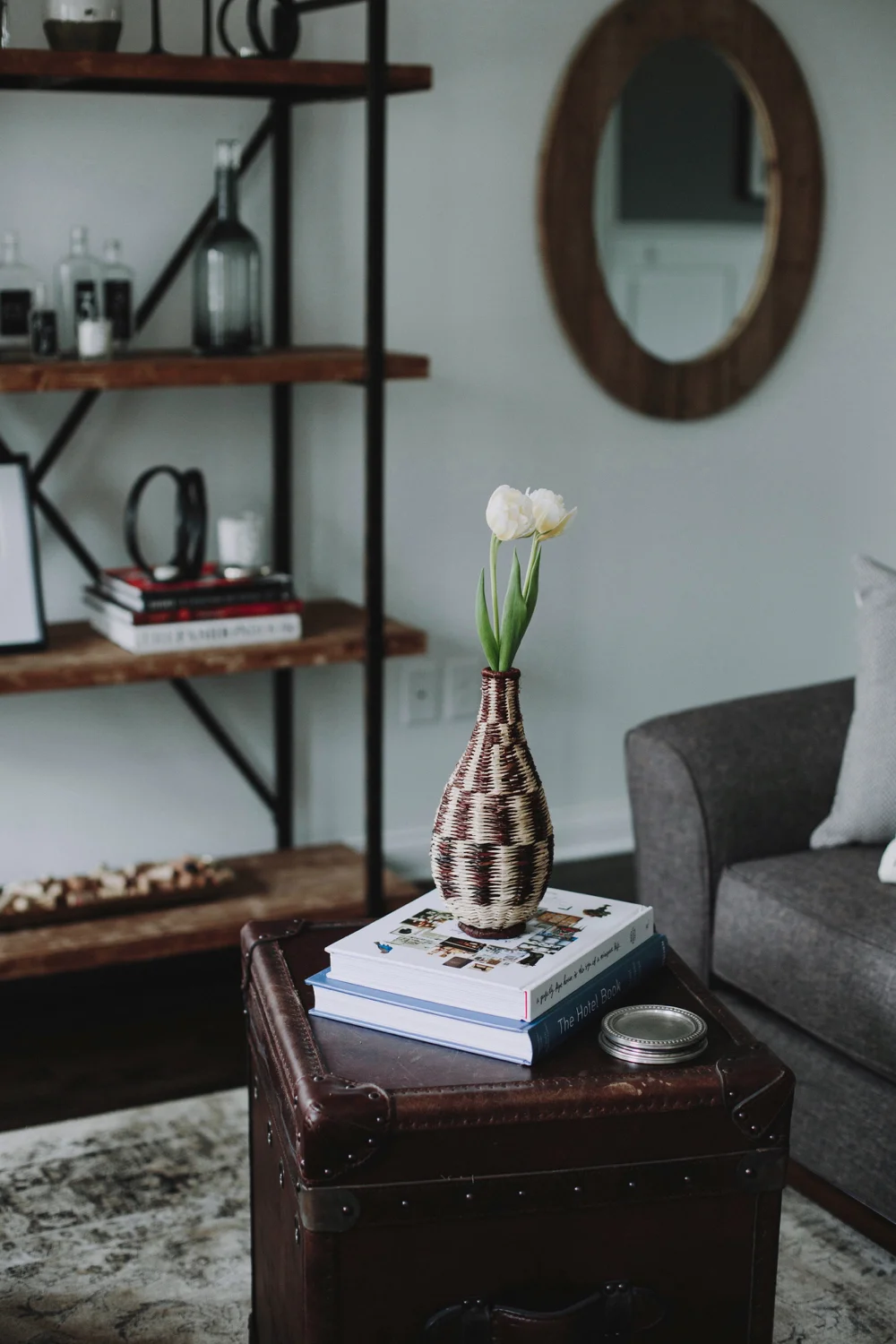
I love a home (and a room) that gives off a well-read vibe. I call this room the study because we combined the idea of an office with a reading room and a little bit of a home bar. It’s kind of just a room for adulting. The leather and brown liquor give the room richness, while the mixture of art, positive quotes, and song lyrics lighten things up. Plus, I had a lot of fun giving the bookshelf its own gradient color story.
THE BREAKFAST NOOK
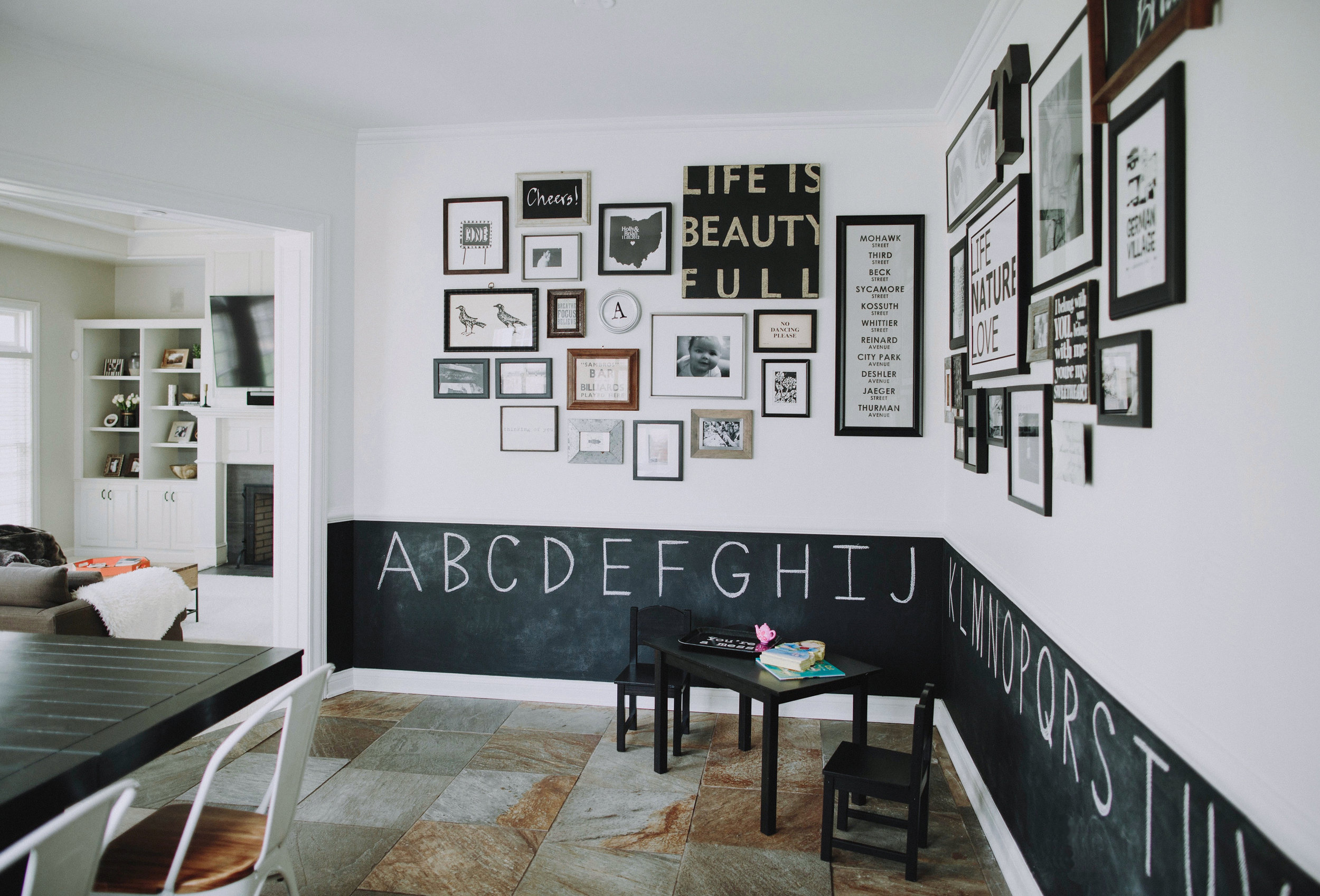
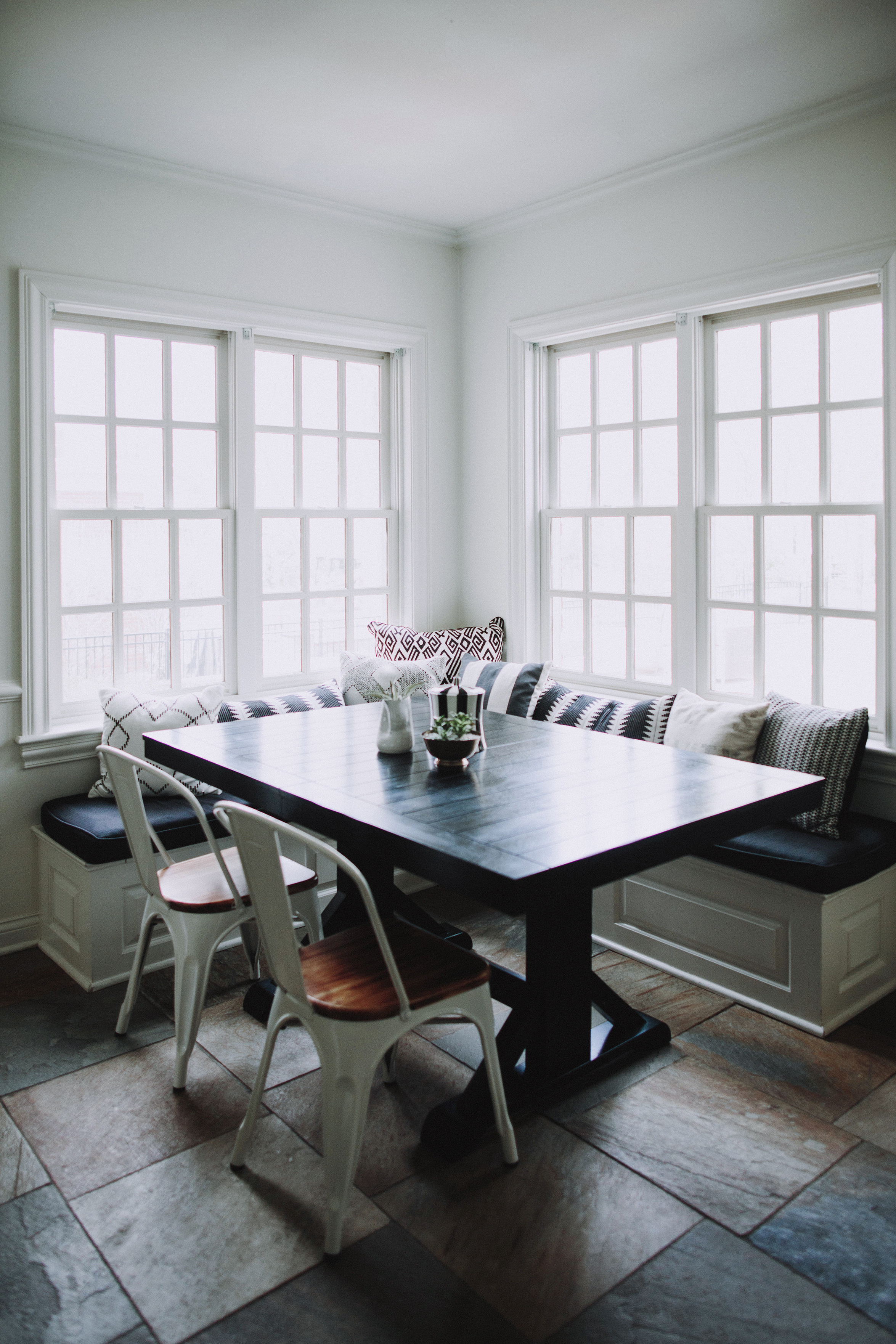
I knew the family would eat most of their meals in this spot rather than the formal dining room. So we created a comfy breakfast nook with abundant pillows in a black-and-white story. We even gave Avery her own table space for snacks and tea parties alike. But my favorite part of this space is the walls. I love a good gallery wall moment, and I wanted to give this one a more kid-friendly twist. So what did we do? We split the wall in two, creating contrast and giving it a dual purpose. The top portion is a black-and-white gallery wall that connects back to the breakfast banquette, with wood accents mixed throughout to maintain a sense of warmth. We covered the bottom in chalkboard paint so that the entire space would encourage imagination and creativity.
THE FAMILY ROOM
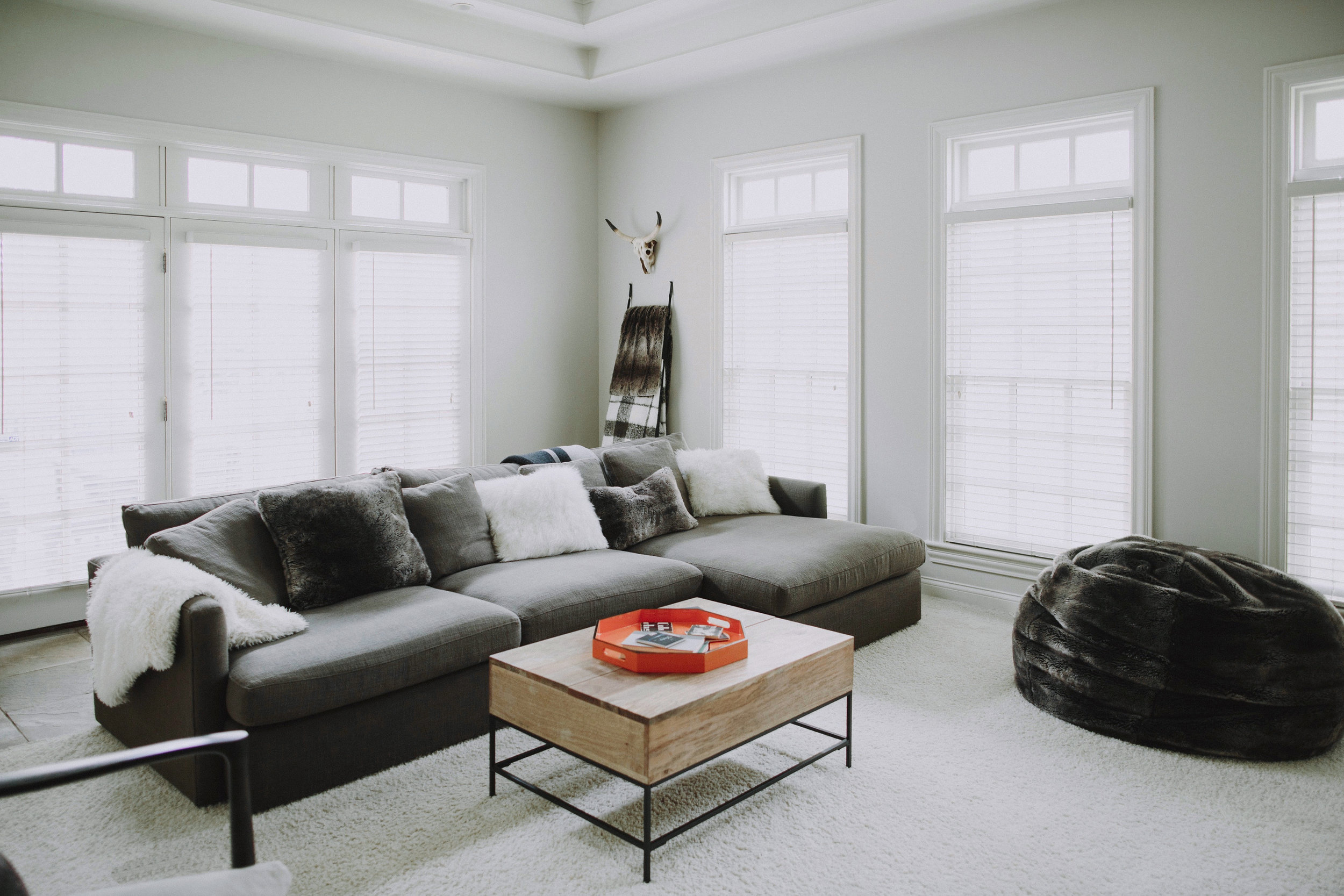
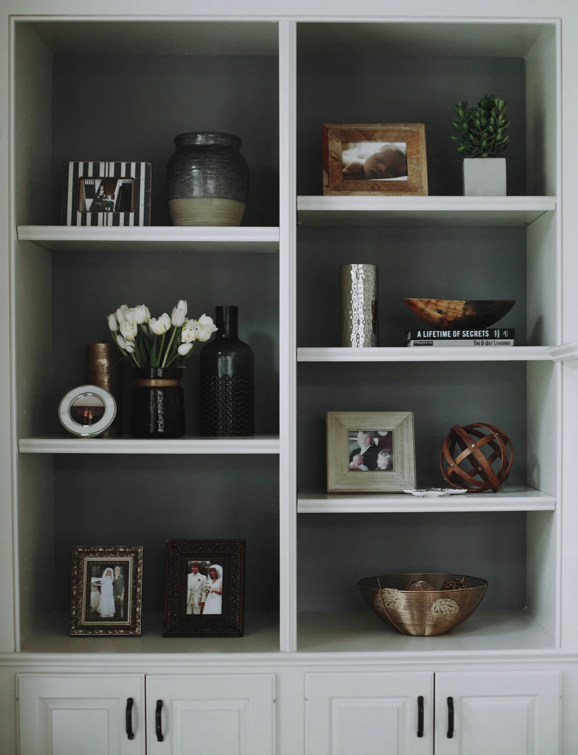
I had three key words in mind for the family room: cozy, cozy, cozy. We used levels of creams and greys with lots of layered furry and fuzzy textures to make the room inviting. For example, there are few seats as comfortable as a faux fur beanbag, and as far as I’m concerned, that’s a seat all ages can sink into. To ensure the room had enough depth of color, we painted the back wall of the built-in bookshelves, which in turn helped the décor and photos we displayed to really pop.
THE PLAYROOM
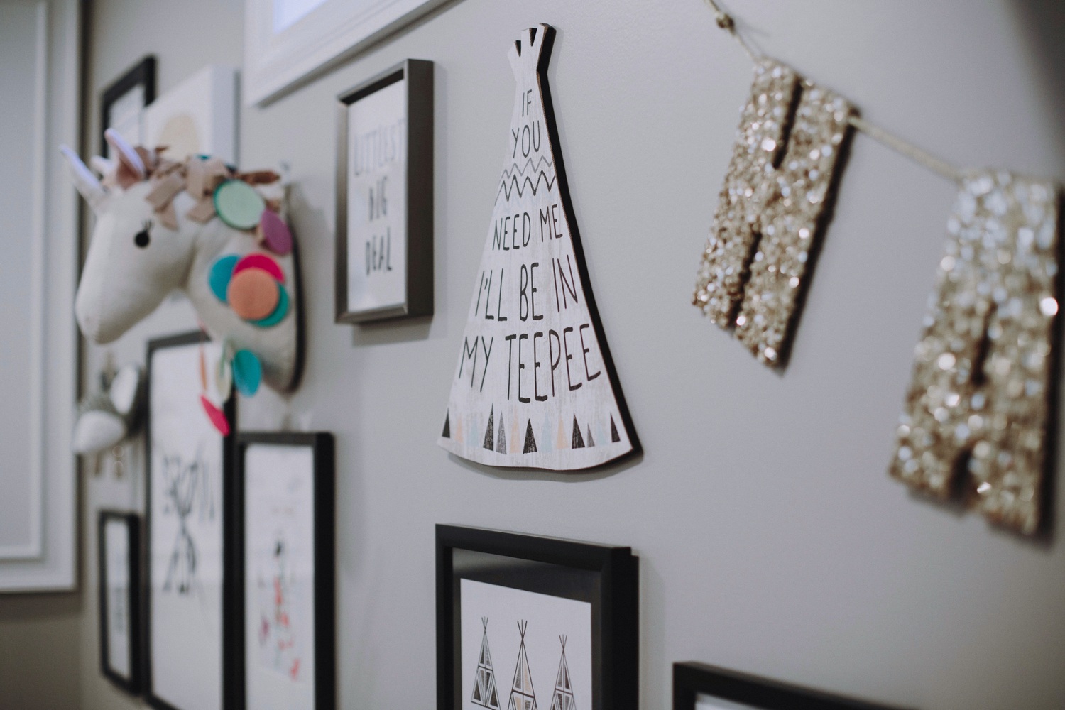
The goal for the playroom was, as you might guess, pure fun, for everything from glamping to drawing and coloring to reading to making a little music on guitar. The gallery wall sets a playful tone with cheeky art, with books, stuffed animals, and pillows scattered throughout for an all-around colorful experience. Growing up is for suckers.
Growing up aside, hopefully this home is one that the family can continue to enjoy for many years to come.
-JS
Want to see more? Check out my other interior decorating work on my (small but growing!) portfolio page here.
Photos by Rouxby Photography


