Over the past year, I've traveled down a few different freelance paths. One of those is interior decorating, but to be honest, it has been one of the most difficult to commit to. I love interior decorating, but I'm relatively new to it, and it can be intimidating to see so much beautiful inspiration on the internet and wonder what new perspective you can contribute to that world.
A lot of my freelance work to date has centered on writing and blogging, with interior design as a key subject. I've developed and refined my own point of view on interior design trends and sensibilities. But having an eye for the subject matter does not always translate to being able to actually do the job.
Thankfully, that hasn't stopped me from doing it, considering how much I enjoy it. But it has slowed the pace just a little bit: I want to ensure the projects I commit to are tackled with clear vision and attention to detail, and I want to know that I can dedicate the right amount of time and effort.
So, when my friend and coworker Allison reached out with the opportunity to redo her kitchen, I was very excited, but intimidated and humbled nonetheless.
And I feel the same nerves today posting pictures of the completed project. But I'm also excited and proud to share the results.
Allison and her husband Brad wanted a brighter, cleaner, and more modern look for the kitchen in their New Albany, Ohio home. We set out with a pretty simple vision: a classic white kitchen with a few subtle twists to keep the space feeling unique to their family.
First, we needed the right backdrop. We painted all the walls a light grey shade to give the entire downstairs a cool, calm vibe.
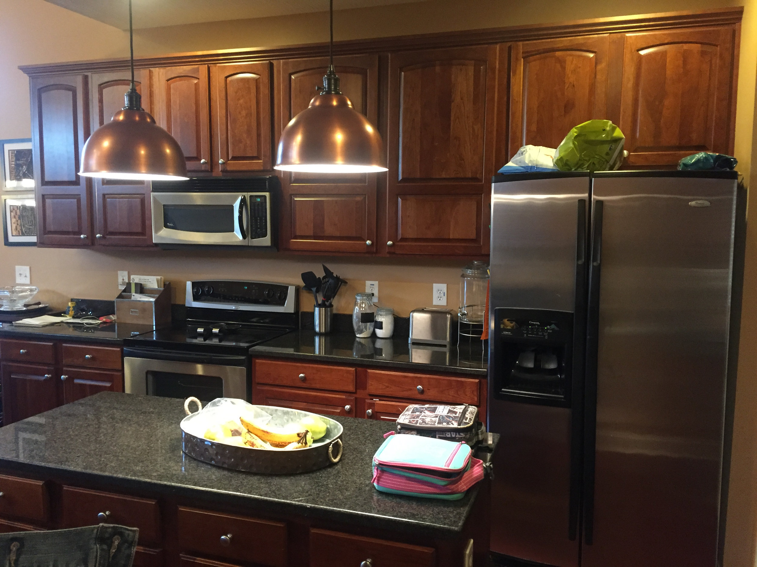
Next, we bid adieu to the dated dark wood finish lining the kitchen. In order to avoid investing in brand new cabinets, we painted them white to create high contrast off the black countertops.
Our first twist? Paint the island black to make a statement in the center of the room.
BEFORE
AFTER
Our second twist? Add shine and texture to the backsplash using glossy grey subway tiles with white grout.
BEFORE
AFTER
Our third twist? A warm metallic touch.
Allison and I both loved her brushed copper pendant lights above the island, one of the few existing accents we chose to keep for the final design. I was inspired by the way the pendants kept the kitchen feeling warm and inviting, and the way the copper shined against a more neutral background.
The copper finish ended up being the inspiration point for selecting hardware on the cabinets and drawers to create copper pops throughout the space. We used a sprinkling of copper décor to reinforce the warm metallic theme as well.
BEFORE
AFTER
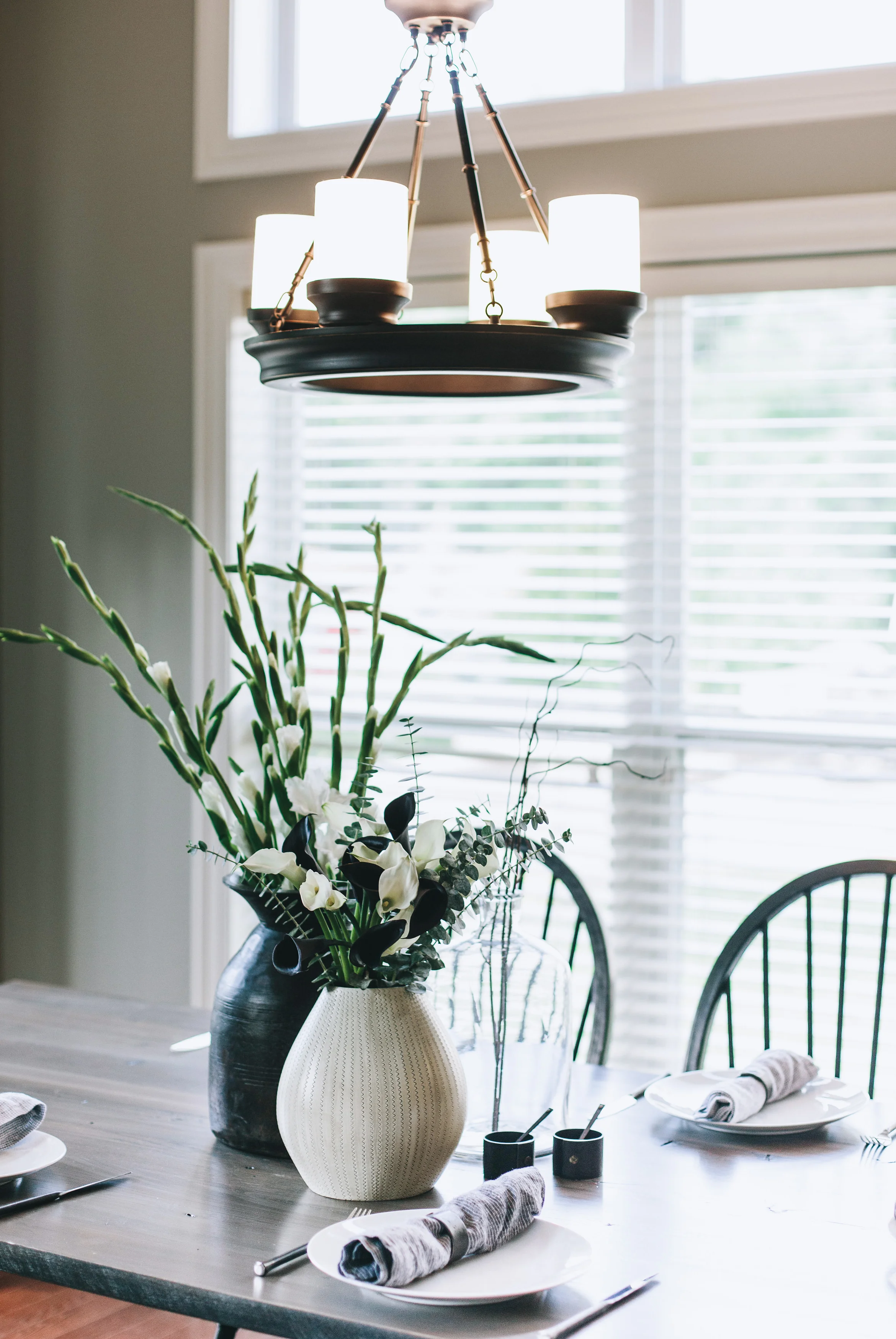
For the breakfast area, we hired our friends at Mount Vernon Barn Company to build an 8-foot custom farm table. Riffing on a classic, we collaborated to create a table base that fused a traditional trellis shape with a more modern, streamlined wishbone design. We opted for a grey finish as the perfect shade to complement the color story in the rest of the kitchen.
BEFORE
AFTER
BEFORE
AFTER
One way to personalize any space is to inject pieces of original art. The art on the kitchen walls was created by Allison and Brad’s two children.
In my opinion, the art is the perfect final twist to make this white kitchen anything but ordinary.
-JS
AFTER photos by Rouxby Photography
Want to see more? Check out my other interior decorating work on my (small but growing!) portfolio page here.


